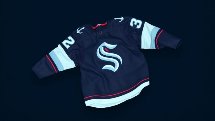
Squished in an isthmus between an arm of the mighty Pacific, the Puget Sound and Lake Washington, Seattle is the northernmost major city in the United States. The city has a history engulfed in sports originating from the Seattle Metropolitans to the latest Seattle Kraken.
The “S” in the logo notes the history of the town – Seattle Metropolitans. As Seattle Kraken’s website puts it, “It is as deep as the Puget Sound.” The Metropolitans played hockey from 1915 to 1924. The Metropolitans is reverred in history for being the first American Team to ever win the Stanely Cup. They defeated Montreal Canadiens by winning 4 games out of 5. The nod to the history makes Seattle logo a fan favourite.
Also Read: Kelsey Plum Net Worth 2024, Salary and Contract
“Kraken” – A mythical beast originating from the stories of Scandinavia. The legends of this mighty cephalopod-like being might have originated from Giant Squid sightings. Now, what is this connection to Seattle? Puget Sound hosts many Giant Pacific octopuses, the largest octopus species, growing over 16 feet, and is known as a descendant of the mighty Kraken. The hollow space is shaped like an Octopi’s tentacle. Additionally, A red eye positioned in the nook of the S glares everyone back.
In addition to the minute historical and mythological details, the color pallette is ravishing. The overall bluey tone gives ocean vibes – Considering Seattle’s history and legacy being a port and trade centre, it is quite magnificent. However, if you’d ask me, the tone is more undersea or the deep sea. Moreover, It reminds one of the unknowns of the ocean, a node to where the Kraken might reside. The red-eye pops a vibrancy into the whole blue.
The symbolism is one of the key reasons why Seattle’s logo is very unique. The logo is quite different from the other 31 teams. It is a modern take which nevertheless approaches a level of sentiment. Additionally, it adds some kind of traditional touch to it. Seattle Kraken envisions a surpreme idea and teh logo delivers. 100%
Also Read: Top 10 Hardest Video Games in 2024
Thank you for reading it. Leave us a comment if you liked it.
Do follow us on: Google News | Facebook | Instagram | Twitter | Youtube | LinkedIn
Have a good day ahead 🙂

